

Compare and contrast
In the responses to the post I wrote about in praise of permanent collections it became clear that writing about art is sometimes an issue for students, especially if confronted with complex or difficult works. I recommended a book that can help with this — Ossian Ward’s Looking at Art, which I write about here.
While Ward’s approach offers one way of looking at and understanding works there’s another technique that is perhaps simpler and can help bridge the gap between description and analysis.
In a lot of learning logs students explain how a work was made and, if its a representational work, compare it to the physical thing in the world on which it is based. That usually takes the form of ‘is it realistic?’, or ‘is it convincing?’. While not a terrible thing to be concerned with, it makes it hard for the work of art to escape being anything other than a version of something else and not something in its own right.
A better technique is to move towards a consideration of two works rather than one. By looking for similarity and difference between two works, each can reveal something of the other. Below is a bullet-pointed comparison of two works — David Hockney’s Celia in a Black Dress with White Flowers (1972) and Henri Matisse’s Reader on a Black Background (1939) — as example of what I mean.

- Both images show women seated in interiors with flowers and black is a major part of the composition.
- The Hockney may even be a deliberate reference to the Matisse.
- The black in the Matisse forms a solid flat background to the work, but Hockney’s work places it in the centre of the image. It is not, however, a solid field but one that describes the form of the woman.
- Both images contain flowers that contrast with the black. In the centre of the Matisse there are two white discs and two which he has added abstracted flower heads. In the Hockey, two large flowers interrupt the view of the black blouse creating two large interesting shapes.
- The lower half of the woman in the Hockney is only sketched in and the edges of the work are less dense than the centre. The Matisse, though, is more evenly finished creating a less illusionistic and more ‘allover’ composition.
- The underlying composition of the Matisse is largely an arrangement of rectangles. The Hockney is different. The woman creates a diagonal that runs from top right to the bottom left of the image. The only hint of any background is a thin line that runs almost parallel to the left had side of the drawing. This line is a framing device, as the plant on the right hand side. In the Matisse there is no such device.
This analysis is almost entirely formal, but if pursued more could be revealed about how women are represented or about the colour relations internal to the work (both pictures use pink or lilac as a counter to the severity of the black). The point is that the Matisse becomes a yardstick for the Hockney and vice versa.
The implications of this exercise ought be clear. Two works can be brought together to reveal stuff about each other. For a student wanting to explore their own work in terms of others’ (that is, to contextualise their work in some way) it’s simply a matter of substituting one work in a pair with their own. Your work may not measure up to Matisse (not much does) but you will learn something about what you’ve done.
 |
7 thoughts on “Compare and contrast”
Leave a Reply
> Next Post Looking at adverts: 15
< Previous Post Book Review:101 Things to Learn in Art School
Drawing Department 2023 Assessment Showcase
8 Comments
As Programme Leader for the BA (Hons) Drawing Degree I am really pleased to...
Read more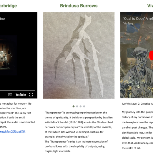
Creative Arts Showcase 2023
2 Comments
The Creative Arts Showcase is now in its third year and is an end...
Read moreArtlab23 Collective
0 Comments
The aim of the Collective is to provide a mutually supportive environment which will...
Read more
OCA’s Online Degree Show Showcase 2023
0 Comments
Welcome to our online Degree Show Showcase 22/23 where we are celebrating a number...
Read more
If anyone wants to read the biggest and best ‘compare and contrast’ exercise undertaken in visual art, I can wholeheartedly recommend T. J. Clark’s ‘The Sight of Death’
It’s reviewed here: http://www.theguardian.com/books/2006/aug/13/art
Thanks Bryan, I found this really useful and I am intrigued to pursue the references.
Bryan, I’m interested that in your discussion about colour no mention is made of either women. Hockney’s subject is referenced from within the tones of the mirror behind the sitter of Matisse’s – in fact most of Hockney’s palette resides in the other’s mirror. Of course we see things in today’s vernacular, where Matisse’s subject is situated within a world and Hockney’s sitter is less tethered – which brings me back to colour.
To be honest, jsumb, it’s just a quick example and I was interested in thinking about the black. As I wrote the piece, more became apparent, which is my point. By placing two images together they reveal stuff about one another. It’s something I’ve begun to use as a tool in my own practice as well: placing drawings of art works in juxtaposition as a way of rethinking them. You can see an example of this on my blog here:
https://bryaneccleshall.wordpress.com/2015/10/29/365drawings-show-your-wound/
Your points about the palette that Hockney has used also backs up one of the things I’m always telling students to do: STEAL FROM OTHERS.
It helps when their are similarities, like you have outlined above, Bryan. Trying to compare two disparate works is harder and perhaps of no real educational value. It reminds me of when, as a student, I was asked to write an essay comparing EH Gombrich’s ‘The Story of Art’ with John Berger’s ‘Ways of Seeing’. They were so different in what they set out to do that it made comparison difficult.
A useful tool – and has proved your point with the subsequent discussion – are you testing us? ;0)
This is really useful. Thank you.