

Best in Show

Busy as I have been writing a new unit for the OCA, planning the logistics of a winter commission, mountaineering and breaking a toe, I had completely forgotten about the results of the photography show I entered back in June. A panel of experts that included Gerry Badger and Simon Roberts awarded Best in Show in the Foto8 Summershow 2012 to the above photograph by Titus Simoens.
Phil Coombes, Picture Editor of BBC Online and also a member of the judging panel explained why Simoens’ image stuck with him:
“The photographer has managed to capture the vulnerability and the contrast between what is going on in the frame and what is happening outside of it.”
We don’t really know what’s happening outside the frame but the cropped torso and leg of whoever is sitting on the top bunk gives a hint of something that we tend to forget when we look at photographs: that there is more happening outside the frame. The thing is, in the case of this winning photograph, we don’t really know what’s happening inside the frame either.
It is that ambiguity, that enigmatic, almost cryptic quality of Titus Simoens’ photograph that gives it enormous conceptual strength.
No, we don’t know what on earth is going on in the image. The photographer invites us to speculate about what is happening in the photograph and what he may have intended to tell us. We know that photographs are polysemic, that they can be read in many ways because their meaning is inherently undetermined. After all, they are only tiny fragments taken out of the rich continuum of events of life.
The fragment that titus Simoens isolated for me – because this is my own reading of the image, disturbs me, although not in a in-your-face, graphic way. The waxy edges of the bunk bed frame and the chipped handrail paint speak of many hands having clambered to the top bunk, of many legs hanging down, purposeless, clad in shiny standard-issue black leather boots like the ones on the top-right corner. The pale blue bed covers, tightly fitted, denote a certain sense of imposed order and discipline. It all speaks of institutional accommodation.
Then there is the teddy duck, looking as sad as the child on the left, whose body language he mirrors. He seems resigned to having a..what? a meaningless life, a regimented life? I’m talking about the duck. Or the child. I’m speculating anyway…
I told you this photograph disturbed me.
 159 images were selected for 2012 edition of the Foto8 Summershow. The slide show on the Foto8 website proves how difficult it must have been for the panel of judges to make a decision on the Best in Show. This year’s selected entries, on display until 18th August, show a bewildering variety of visual and conceptual styles, all of them tucked under the umbrella of documentary.
And just in case you wonder, I’m not in the slightest disappointed about not being the Best in Show. In a true Olympic spirit, the most important thing is not to win, but to take part.
14 thoughts on “Best in Show”
Leave a Reply
> Next Post OCA student wins a Saatchi Showdown prize
< Previous Post Van Gogh to Kandinsky at the Scottish National Gallery
Tutor News – Katrina Whitehead
6 Comments
Some of you will know me as your personal tutor, or you may have...
Read more
Student Stories: Julia McLean
2 Comments
OCA Photography Program Leader Dan Robinson caught up with Julia McLean about her experience...
Read more
OCA’s Online Degree Show Showcase 2023
0 Comments
Welcome to our online Degree Show Showcase 22/23 where we are celebrating a number...
Read more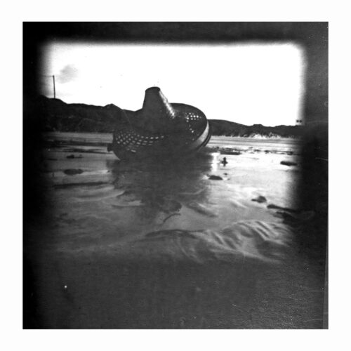
Student stories: Nuala Mahon
30 Comments
I have arrived at the finishing line of the long adventure that is (or...
Read more
Several things disturb me about this photograph (1) even after the explanation from Jose, why don’t I get it? (2) if this is the best in show, what were the others like? I’ll have a look later (3) If I submitted an image like this to my tutor he/she would probably say I need to crop out the figure in the top right (4) and since I really don’t get it, how will I produce similarly ‘conceptual’ images? (5) Am I doing the right course?
Thanks Jose..
You mention your own reading of the photo, and it also struck me once again how the context of our own experiences and past put (twists? distorts even?) how and what we read in an image.
This afternoon I watched a Singaporean movie, 4:30 (director Roystan Tan), mentioned it on the Flickr group earlier. Dealing with the alone-ness of a young boy, and how he desperately tries to create some form of relationship, in his longing for human contact.
This really struck me a bit of a blow, since I know of at least one or two kids in something of a similar situation.
This fresh info brought along when I just viewed this work, made me realize that we as viewer bring a lot of baggage along, when viewing a photograph, and try to make sense of it.
What makes it even harder, and more complex, is that we as photographers are / should be aware of this.
My thoughts now go into how to successfully learn to see and realize these opportunities in creating such invitiations to our viewers.
Noticed one of yours at -2:59 Jose… cool.
Mmmm, of course, the way photography is, not all the work in the slideshow will be everyone’s cup of tea… but there most certainly are some truly excellent work (for me / where I am now).
Had to smile when I saw the study of Mike Kemp’s Shanghai chairs.
Paul Gaffney’s Untitled of the underside of the roadways and nature hit a cord with something I’d like to work on…
As a thought to Jim… I kindly disagree from you… I’d take a gamble and say that except for the whole thing about ‘you have to learn the rules before you can break them’, context an intent is an incredibly important element which was most likely part in the creation and editing process by this photographer.
It’s a haunting image Jose. At first I thought it was something like an asylum seekers hostel but when I looked on Simoens website I saw it was from a series on the Ibis School, Ostend. From a further search I learned that Ibis School is a boarding school for boys who come from troubled homes or have behavioural problems. They’re trained to become fisherman or mariners. There’s such a story there to be told. I don’t know why but it makes me think about the Workhouse.
Because we are out of the frame our/my consciousness connects with the figure on the edge of the frame and links us to the boy, his vulnerability. It seems to me to be about power, controlling through position and strength. I agree with Catherine it is a haunting image. I have seen that wear on the metal handles on a series I am doing on funeral directors, knowing the frequency of use has caused creates an inevitability in the narrative.
Just got an email from foto8; and it explains more about the image and the series of which it forms a part. [http://www.foto8.com/new/online/photo-stories/1605-blue-see]. Catherine was spot on when she mentioned the school; and Jose’s reading of the image was pretty spot-on. But it still leaves me thinking that in order to ‘understand’ an image, you really need to know more of the back-story?
I would say that in order not to misunderstand it you do, but in order to understand it you don’t. I’m not playing with words. I’m talking about visual language. Are the photographer and viewer communicating in the same visual language? If not, then an interpreter is needed – e.g. text, a critic, etc…
Well, I know it’s not that simple but you know where I’m coming from.
Had to read that a couple of times—but I understand what you are saying. Maybe I will become more ‘fluent’ in the language the more I ‘speak’ and ‘read’ it?
Whether or not photographs should have captions or accompanying, explanatory text, has always been a hot issue. What I mean is that we may not accuracy guess what’s happening in an image without the help of text, true. But if that images conveys universal values, perhaps we don’t need that text after all.
Do we need to know where and when the above photograph was taken, and the history of the child in it, to sense the vulnerability and solitude of that child?
I don’t think we do. I think the above photograph does the job well without captions.
Can’t get the page to let me respond to your comment about captions. No we don’t need to know the background to sense the vulnerability of the child. For me it was the other way round, because I ‘understood’ the child’s feelings of isolation, that made me want to know more about the where and the why—does that make sense?
It does make sense Vicki – a lot. If the photograph does that to you, then the photographer has been successful; something (a feeling, a concern) has been communicated without the need of textual crutches.
Thanks Vicki, I agree that it would be helpful to know more about the back-story. Whilst Jose and others have correctly read it, I know that they have more experience than myself and more perhaps than others working at Level 1. So it would help in future to have more of the background ‘out-of-frame’ aspects made explicit. now that I have this information, I can see much more clearly why the image is so highly rated.
Jim, different images elicit different responses in people, so a position of ‘this picture doesn’t do it for me’ is also perfectly defendable. What matters is how that defence is articulated and substantiated – critical thinking, something we encourage at the OCA.
I can’t think of any images from the top of my head now but there have been many, many photographs that other people raved about that didn’t do it for me.
Actually, that would be a good topic for an OCA post.. “images that didn’t do it for me”.
This ties up with the thread about critical thinking that you made on the post about Catherine’s blog. Think it could be a worthwhile exercise to help us develop such thinking and thought—although I think it might have to be one conducted in the OCA forum—I’d be a little braver about voicing my thoughts there.