

Colour Matters

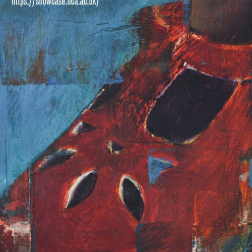
Feeling blue? The bright work of Jenny Ford opposite might just revive you. This relates to a question asked by a student yesterday, – why is so much contemporary textile art colourless and drab? Why is it assumed the better you get, the more neutral your work will become? Note they were referring to textile art specifically, not functional textile design. Is that statement true I wondered and if so why? Certainly looking around at the work of artists at the Development Weekend I attended recently (previous post) the majority of the artist’s work, if not actually colourless or neutral was subdued, even faded looking, apart from some strong black tones. I suspect several reasons; colour is often the first thing that strikes the eye, much more obvious than texture or even shape. After a while, as one studies form more closely, the subtleties start to emerge, the textures that aren’t seen on first inspection, and so one starts to concentrate on these aspects more closely. There has to be an element of fashionable here as well, as there is in any visual format. The more well known textile artists take a while to emerge, so maybe (and this is merely a suggestion) they echo the mores of a few years back, when minimalism was in and neutrals were strong?

Looking at interior decor and fashion at the moment, colour abounds, so maybe its just a matter of waiting for textile art to catch up? Maybe there’s an element of wanting to look serious about our work as well; does colour have overtones of frivolity or lay too close to the something suspiciously decorative and lightweight? Actually, I think a more colourful trend has already started, it may even run alongside the other – look at some of the examples here. Also, some textile artists, such as Alice Kettle and Michael Brennand-Wood have always used a lot of colour in their work. In neither case does it feel superfluous; colour gives their work an energetic quality, in Kettle’s case, adding to the line as a means of almost visceral expression.

Tilleke Schwarz always manages to use colour in a playful way, but that very quality of colourfulness has meaning within it. Schwarz references graffiti art and children’d drawings in her work, alongside some serious and poignant observations about life. Colour, often bold and childlike, is used in her work to reinforce those very connections.
I would certainly call all the textile art mentioned here “serious” in that the work has meaningful content (click on the photo left to read Schwarz’s interesting thoughts). Perhaps an innate expressive connection between the word “serious” and certain colours (black, grey?) works on us unconsciously so we feel the opposite ought to be true? In any case, I will leave you with a link to the following colour related website – Colour Scheme Designer – designed by a graphic artist, it allows you to create the exact complimentary for any given colour plus loads of other permutations and play for hours on a wet day.
4 thoughts on “Colour Matters”
Leave a Reply
> Next Post Assessment Feedback
< Previous Post Burtynsky: Oil – OCA study visit
OCA’s Online Degree Show Showcase 2023
0 Comments
Welcome to our online Degree Show Showcase 22/23 where we are celebrating a number...
Read more
Student stories – Jane Murdock
4 Comments
The grant, by enabling the partaking of this exhibition, has produced some long-term affects...
Read more
Student exhibition: Beverley Williams
14 Comments
OCA Textiles Student Beverley Williams will be culminating her studies with an upcoming exhibition...
Read more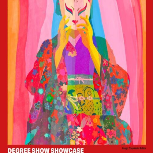
OCA Degree Show Showcase 21/22
0 Comments
Welcome to our online Degree Show Showcase 21/22 where we are celebrating a number...
Read more
Hi Trisha, thanks for your positive comments. The image is a detail of my work playground. For a full view, visit the gallery section on my website. The quote is from a piece of art by Susan Hiller (USA). I fully agree with her text and quoted it in my work together with her name (light grey)!Also like to inform you that I have just published a new book. I can send a preview if you like (just email me).
All the best,
Tilleke
Not just in textiles, but also in painting, is colour a scary thing. A lot of degree shows I see are very monochrome indeed. But, it is changing- and about time. The trouble is, I think a lot of artists are nervous when it comes to colour and don’t know how to use it to their advantage. I couldn’t open the link, but complementary colours, and mixing neutrals from them, is a good sound base to spring from.
Colour in textiles brings to mind the wonderful cape woven out of saffron coloured spiders’ silk I saw at the V & A. It’s just one colour- but what a colour!
Yes, celebrating colour must be on our minds at the moment! When the Southwest Textile Group exhibited recently at the NEC in Birmingham we set out to create an “Elemental Rainbow”. Individuals each selected a rainbow hue to create a 5″ by 8/10′ textile strip and a 5” square. Although each of the individually worked pieces were intriguing in their own right it wasn’t until they were all assembled together that the full impact was realised – so much so that we’ve now decided to continue our theme as we go “Over the Rainbow” in Totnes in November!
You can see some of the strips in situ at http://www.facebook.com/southwesttextilegroup
Hi Trisha, so pleased you spotted ‘Nutcracker’. Colour is important to me as I have really worked at using it. Interestingly, my first MA pieces were entirely constructed from black velvet.