

Designing books is no laughing matter
Chip Kidd, the American graphic designer and author explores the role of the book cover to give form to stories and ideas. Reflecting on his first graphic design lesson, in which his tutor said you can either show the content, describe the content, but never both. Kidd presents how this fundamental idea of respecting an audience’s intelligence by not over stating an idea has played out in his work. It’s an excellent demonstration that decision making in graphic design is driven as much by philosophical positions as aesthetics, that to create a first impression through a book design you need to intrigue as much as inform the reader.
12 thoughts on “Designing books is no laughing matter”
Leave a Reply
> Next Post Who buys art and why?
< Previous Post Prunella Clough
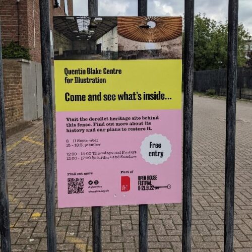
The Quentin Blake Centre for Illustration
2 Comments
Last week I was lucky enough to have tickets for the Open House Festival,...
Read more
OCA News: Student Fees from August 2022
8 Comments
We are announcing today, Tuesday 17th May 2022, the fees which will apply to...
Read more
Augmented Reality – what place does this have in art?
8 Comments
The primary focus for Artivive, going by their website, appears to be its use...
Read more
LGBT+ History Month
0 Comments
February is LGBT+ History Month in the UK, a month-long annual celebration of lesbian, gay,...
Read more
I mentioned this on my blog a while ago – well worth a look!
Yes – well worth a look. At first his outfit rather put me off and I was asking myself “Is his outfit showing his content, if so will it be a flow of mis-coordinated ideas?” However, I was wrong and it also shows me that you needn’t necessarily judge a book by its cover so it’s always best to dip into it as well before you buy or borrow.
He’s engaging, caught and kept my attention and covered all the reasons why I prefer to read actual books. The look, the excitement of the cover and the way it can feel and look. Also as Chip Kidd says – an iPad is great but, “Smelling it will get you nowhere!”.
Catherine, that was the first thing I did when I got my Blurb book. 😛
“an iPad is great but, “Smelling it will get you nowhere!”.”…how true! I also keep thinking how many book I can buy for the cost of an iPad or Kindle…and they won’t expire or break down.
My Kindle Touch died yesterday…
Saw this via Rob’s post… thought it was great, and like Yiann says, added a different perspective on As. 2 PWDP.
OMG, fantastic! I wish I had seen it earlier (prior Book Cover assignment) but it is still giving me even more ideas. Thank you.
You’ve probably seen it already but, if not, there’s a really good book in the Basics series – ‘Layout” by Gavin Ambrose and Paul Harris. It looks at the arrangement of text and image on a page and has case studies,exercises and lots of visual examples. Also each chapter is printed on a different type of paper so the look and feel vary.
Thanks for that Catherine, I hadn’t seen it. On its way now.
Hugely entertaining and inspirational!
Very cool.
An interesting video. Ironically I found his presentational mannerisms difficult to watch but agree with Catherine that it is worth persevering for some useful content. The layout book looks looks good too Catherine – one more for the wish list.
Like Eileen, I found Chip Kidd’s presentational style a bit OTT, but I was very interested in the ideas he put forward. Some of his book cover designs were inspirational – like the ‘life of the Buddha’ on the book spines, and the “IQ84” cover. I’ve taken a look at Amazon for the “Layout” book Catherine mentioned – it looks really good. Thanks for the recommendation.