

A room full of illustrators
 This is a post from the weareoca.com archive. Information contained within it may now be out of date.
I attended an Illustration masterclass at the Guardian on 14th September. I really had little idea of what to expect but it was a packed day with insights into a range of illustrators’ working practices, plus tips and advice, and an opportunity to rub shoulders with other budding illustrators. All the speakers believe in the importance of drawing and drawing practice, and that the more you draw, the better you get, but also that technique is nothing without good ideas. Every master emphasised the mantra that personal work reinvigorates your portfolio and stimulates new lines of development. Another aspect all agreed on was that when the design/illustration brief is very open it is more difficult if you don’t get a brief from a client, so write your own. But all had much more to say. First up was Paul Willoughby; illustrator and art director who is responsible for Little White Lies magazine covers.  He explained how he developed the concept for the covers: a single face forward head, in different guises for each edition, it’s powerful and it works. He said it helped this design to make use of Photoshop’s ‘guide’ plug-in, which gives a grid that enables the heads to be consistent in size and shape. On a prosaic level his top tip was to take regular breaks: work for 25 minutes and then take five minutes rest. He also recommended placing weird constraints on yourself to provoke creative outputs eg working on a scroll, rather than sheets of A4 paper, or doing a woodcut rather than pen and ink drawing. He also recommended using oblique strategies such as emphasising the flaws in your work for example. He advised that videos should be kept under 2 minutes, that any design you do should work on mobile devices and that you should use big fonts. Paul’s work is pretty ‘reductionist’ in style and approach and he has this in common with most of the presenters. It seems that top illustrator/designers are minimalist.
Emily Forgot was next designer up. She has a strong visual language of her own but different ways of expressing it. She recommends surrounding yourself with things that resonate with you, and be true and authentic to your creative self. She recommends asking clients which style of your work they like to avoid misunderstandings. It was interesting to see ‘legs’ popping up in nearly all her current work. She said: ‘Have something that marks you out and is recognisably you, such as legs!’
David Foldvari is an illustrator who originates from Hungary. He currently illustrates David Mitchell’s column in the Observer. Working mainly in black and white, his illustrations are pretty menacing on the whole. They all solve a problem and show what a flexible visual language he has. He reuses bits of his work in new commissions and recommends this as a way of consolidating your style and making it a living breathing entity. He talked about chopping up work, working big and small, using biros and any other tools to communicate simple emotions.  He suggests practising communicating simple emotions with a range of tools is good practice, and keeping all the little doodles you have as they may get reused in finished work. He advises the use of libraries to see/research obscure material and also referencing ideas that you have a strong cultural connection with. He’s used to working fast and believes limiting time and options promotes speed and productivity in illustration practice. David suggests looking at a year’s worth of work on one sheet. Can you see a pattern? What does it say about you? Have you developed?
Noma Bar is an astonishingly gifted graphic designer. He was generous with his ideas and open about his process, and some of what he said can be found in an interview he did with DesignBoom. Coming from an Isreali background he beleives that his constant play with the idea of ‘two’: opposites, negative and positive, etc comes from being brought up within a split community, where the tension was palbable.  Most of his most powerful images/symbols play with the notion of tension between two. He makes fantastic use of negative space and double take images. He sees his role as someone who takes the world’s toughest issues and making them easy to take in. Noma recommends referring back to things you did a while ago or even a long time ago. He talked of pushing your technique, extending it. An example of Noma extending his technique was his creation of images similar to the 2D images he normally creates in 3D. Similar images were created using corners of rooms painted and with objects and then photographed. Noma’s drawings look very pared down and simple but it can take anything from 2 to 300 drawings to reach a satisfactory conclusion. It’s interesting to note that he works for 7 hours on paper before going to the computer.
Mr Bingo joined the day via Skype. He is well known for the publication of his collated ‘hate mail’. He gave us a set of do’s and don’ts on old postcards in his spidery handwriting:
Don’t run before you can walk
Show work that you enjoy making
Don’t expect instant success
Put your work in the right place ie target places and people that might be interested in your work
Embrace failure
Don’t throw any drawings away
Do edit and don’t rely on work you did awhile ago
Change your environment when you get stuck
Don’t work for free
Try selling ‘things’ ie t shirts, boxes etc
Don’t ever be satisfied
Don’t try to follow trends or try be someone else, do what you do best
Write down ideas
Try having an agent
Don’t give up
Do self initiated work
Malika Favre, a french designer, had this to say about her own work (in a strong french accent): ‘It is sexy, colourful, minimal, bold and playful and has a narrative’. It certainly is all of those things. The most startling of all her work was her self initiated Karma Sutra alphabet, which she even got gently, subtly, animated. ‘Without vulgarity, please!’ 
Adrian Johnson started his professional life well, getting work from the Independent and children’s book illustration work straight from college. However, then he went on to do lots of dry business work and didn’t like what he was producing. So, he stopped and asked himself what it was that made him tick. As a result he started to do more humorous work. ‘The minute I started to do things that were true to myself, things started to take off.’ He set himself a target of creating thought provoking work, but also does work on impulse. ‘I am interested in things I was interested in as a kid such as mythologies, westerns, soldiers. I’ve never been trendy and that’s a good thing’. A characteristic of his work that is striking is that he creates one central image with a plain flat coloured background.

Inspirations mentioned by this team of masters were many and varied but perhaps top of the list was Milton Glaser: ‘Understanding development comes from failure‘. There was unanimity that the slow burn, long lasting careers in which designer/illustrators had sustained and developed practice over a lifetime were the top inspirations.
There was quite a lot of discussion about whether social networking was beneficial, and the lines on this subject were inevitably pretty split by age. However all agreed that if you make good work people will want to share it. Most of the illustrators present use Behance.net to promote themselves, and several recommended Cargo as the tool of choice for creatives wanting to develop a website.
2 thoughts on “A room full of illustrators”
Leave a Reply
> Next Post Study visit to see the Damien Hirst show in Walsall
< Previous Post Ian Dury and Elaine Sturtevant
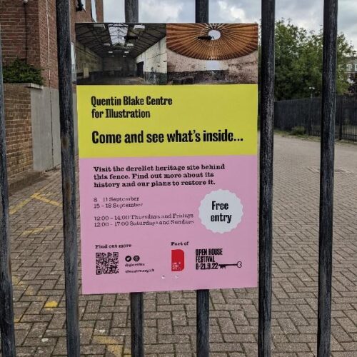
The Quentin Blake Centre for Illustration
2 Comments
Last week I was lucky enough to have tickets for the Open House Festival,...
Read more
OCA News: Student Fees from August 2022
8 Comments
We are announcing today, Tuesday 17th May 2022, the fees which will apply to...
Read more
Augmented Reality – what place does this have in art?
8 Comments
The primary focus for Artivive, going by their website, appears to be its use...
Read more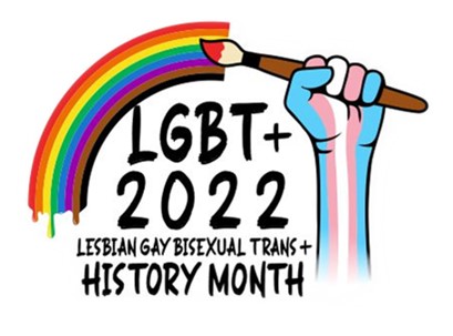
LGBT+ History Month
0 Comments
February is LGBT+ History Month in the UK, a month-long annual celebration of lesbian, gay,...
Read more
That’s a really interesting report providing a strong flavour of a diversity of eminent illustrators.The images shown are very “graphic ” in their visual language but they represent only a small dimenison of the vast stylistic range in contemporary practice ,in which drawing and markmaking and use of” tradiitonal media” still enjoy popularity with art directors and commissioners.
Hi Jane, Thanks for such a helpful and detailed description of the event and what was said. I found everything you wrote of huge value and will definitely be exploring the work of the illustrated you mentioned.